


At Secret Linen Store, colour has always held a special place in our homes and in our hearts. More than just a design choice, colour is a feeling, a mood, a way of shaping how a space welcomes you in and how you unwind at the end of the day.
With Living in Colour, we’re inviting you to explore how colour shows up in your home and what it means to you. We've gathered together lots of different ideas and inspiration below all around exploring the joy of colour.
Whether you lean towards soft, calming colours or joyful, louder ones, we hope these pages help you think about how you use colour to create spaces that feel personal, comforting and full of life.
Inspiration & Advice

Colour Guide
How To Use a Colour Wheel
A colour wheel is a brilliant tool that can help us identihfy perfect colour partners and build harmonious palletes. Here's how to use one properly.

MOLLY MEETS
Colour Expert (Wallace Sewell)
We sit down with British design studio Wallace Sewell for a deep dive into their fascinating relationship with colour.

Colour Guide
How to Keep Your Colours Intact
We spoke to our friends at Wilton, laundry and fabric care experts, about everything from common washing myths to daily habits that keep colours vibrant for years.

Colour Guide
How Colour Affects Your Mood
Read all about how colour can influence our mood, our energy, even how calm or uplifted we feel day to day.

HOW TO
Create Your Personal Room Colour Palette
Learn a simple, fool-proof method for building a room colour palette you'll truly love - starting with a photo, a hero shade, and five supporting colours.
Our Colour Worlds
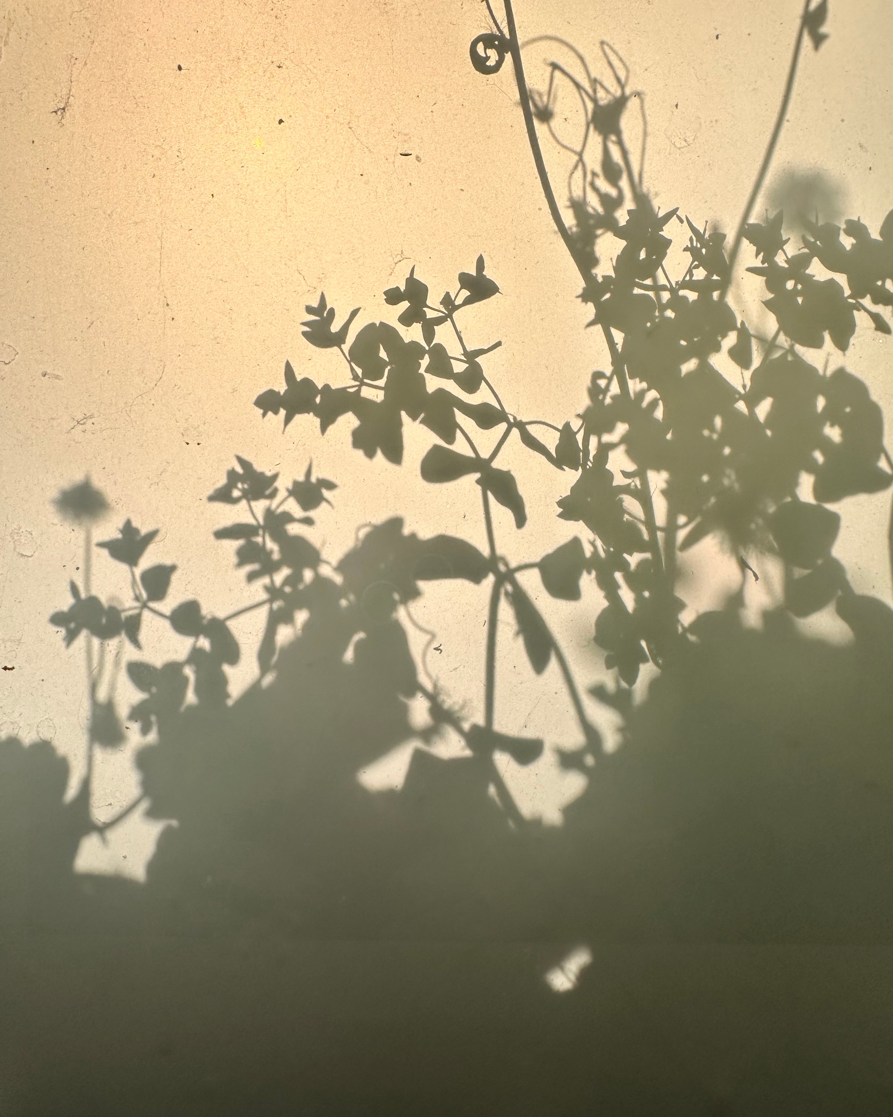
Sunshine Softened
This palette is rich and full of warmth – earthy saffron, deep olive, terracotta and powder blue, all softened with time. Like a spice market at golden hour, it’s both grounding and uplifting. There’s a sense of adventure here. These colours will bring depth to any room. These are colours that spark the senses and stir the soul, and we’re very exited to be here.
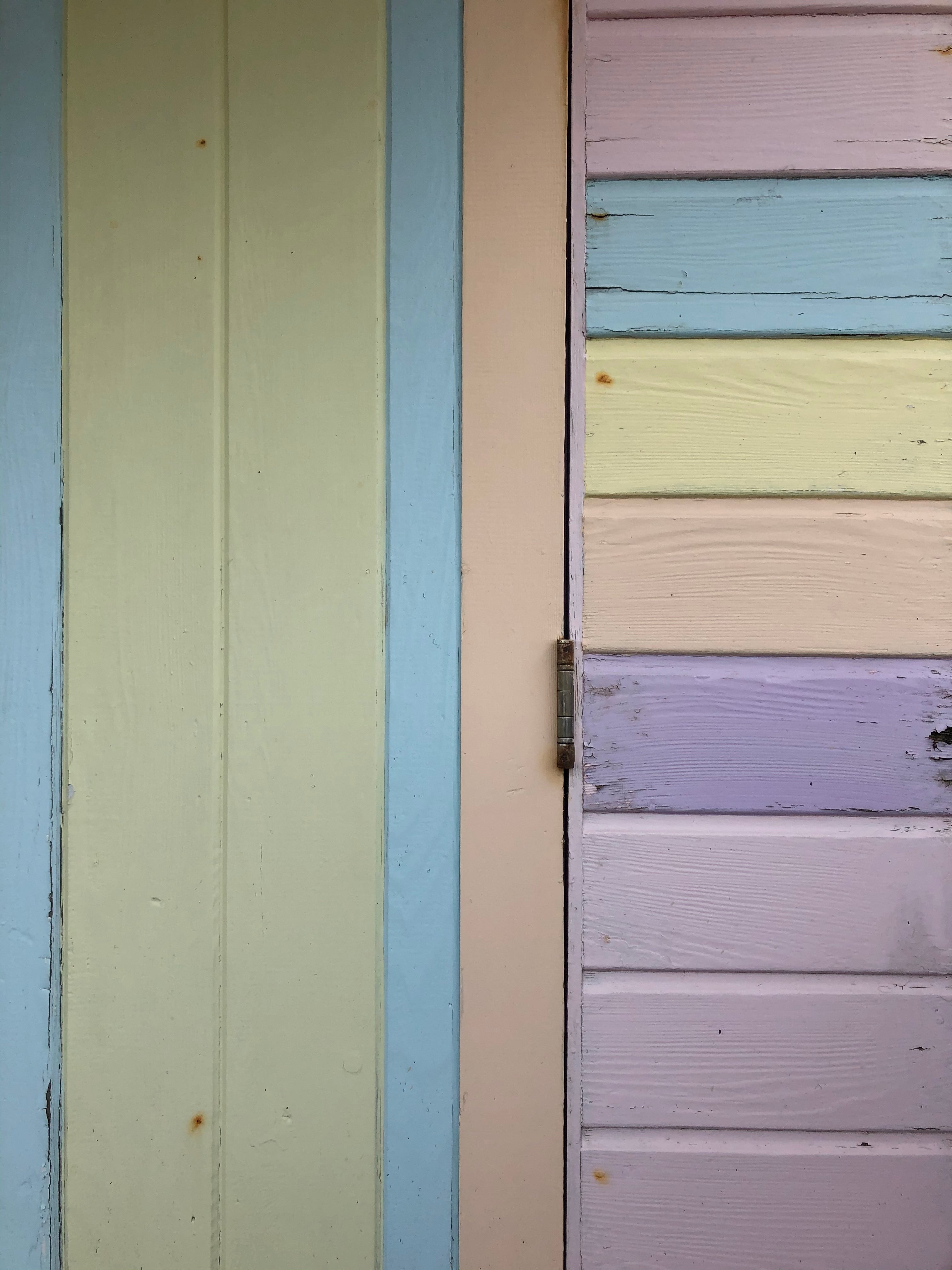
Summer by the Sea
This colour palette is sunshine-soft and joyfully nostalgic. Mellow yellows that feel like morning light, with fresh greens and easygoing blues that feel familiar like the playful spirit of the 1980’s. A tiny pop of pink brings just the right amount of fun, adding warmth and whimsy without stealing the show.
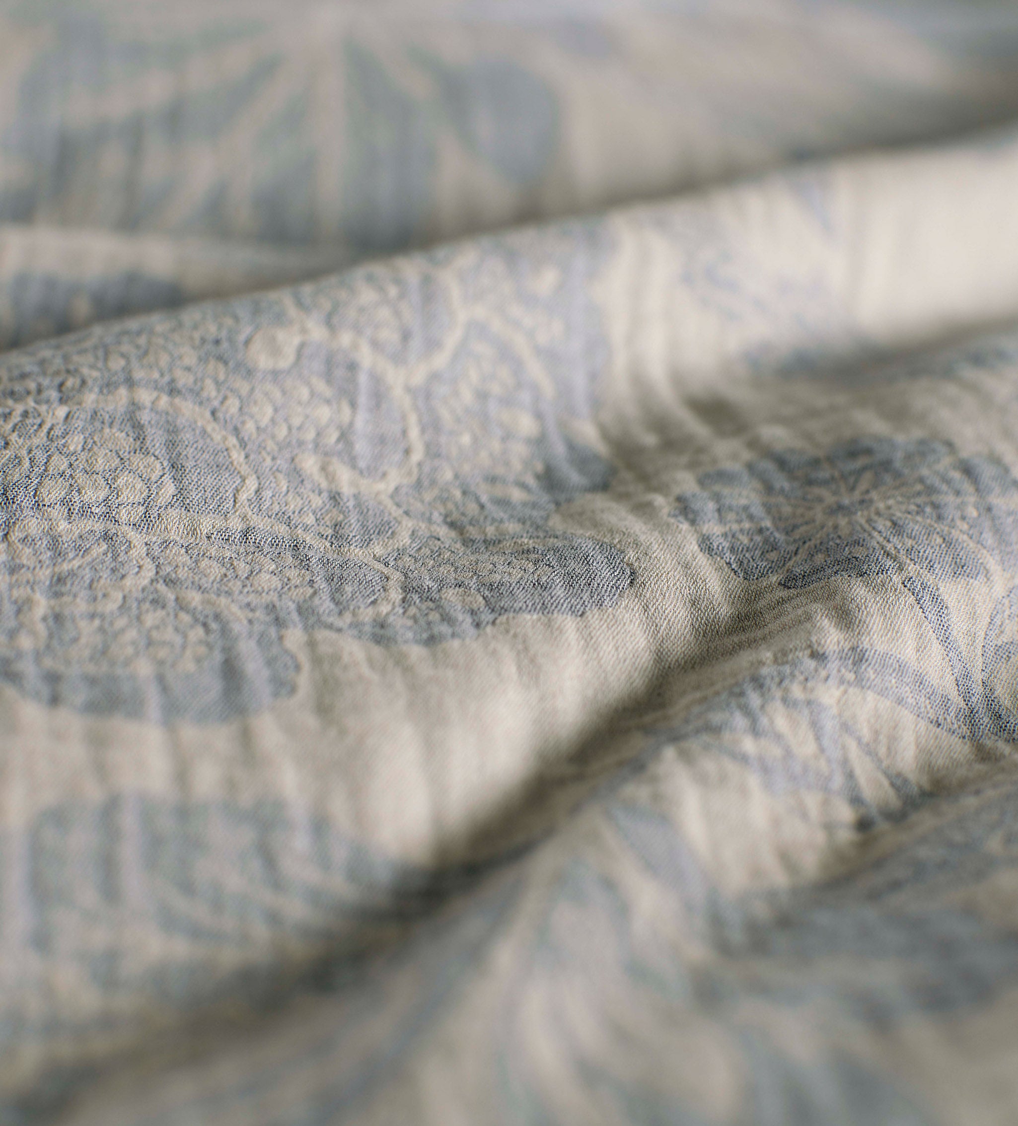
Barely There
This palette is soft and sun-faded – gentle blues, earthy greens and dusty romantic pinks, like colours you’d find in old botanical prints or washed-out summer linens. Nothing too bold here, just a calming blend that feels lived-in, loved, and super easy to layer.