


The clever old colour wheel, so important, and so so useful. We have been using the colour wheel since 1666, when Isaac Newton demonstrated that white light could be split into a spectrum of colours: red, orange, yellow, green, blue, indigo, and violet. He put them together in a continuous loop, and this became the foundation of the wheel that we use still today.
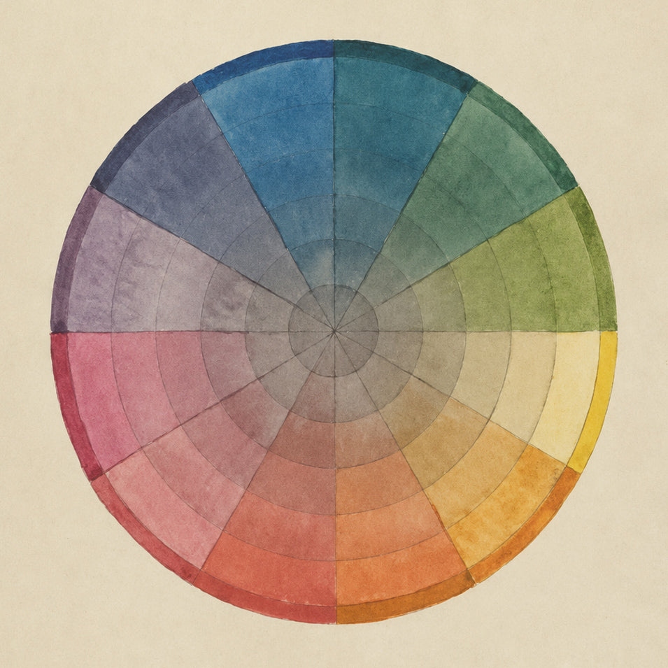
As the colours form naturally next to each other in this wheel, they help us no end to create, play, mix and match and find colour combinations that work and make each other come alive.
I love colour, and I love the colour wheel as a thing of complete beauty all by itself. Here are my handy tips on how to make it work for you, and how to create and use colour (even if it feels a little daunting.)
I really find that creating a mood board is the best way to make sure that the colours work for you. If you can, get some swatches or fabric, paint colour charts, scraps of paper… anything will do, so long as it is a colour you like.
This is a really good way to pick all the colours that you want to use in your room. You can then choose textiles, rugs, lighting, wall colours and curtains from your palette. Remember, inspiration for colour is everywhere.





Your Hero
Start by picking the main colour that you want your bedroom to contain (calming blue, warm terracotta, soft green, honey yellow). This becomes your starting point on the colour wheel and sets the palette for the whole room. This colour might appear a bit more than the others, so I would say that this one should be quiet, or easy, not a bright or poppy colour.

Complimenting your Hero and making a statement
If you want your room to have contrasts, and make a statement, go for this approach. Look directly opposite your hero on the colour wheel to find its complementary colour. Using small splashes of this complementary colour (cushions, artwork, lamps) adds energy, but without overwhelming the room. You can be sure that the two colours work together, and know that they will sit alongside each other just fine. My favourite example of this approach is blue and orange, like the sea and a splendid sunset.

Blending with your Hero
For a softer, more restful room and décor, choose colours that sit right next to your hero colour on the colour wheel. Choose three or even four and pick your décor colours from there. Colours that sit next to each other on the colour wheel naturally blend together and create a calm, layered bedroom palette. I just love greens and yellows together… colours that are so often seen in the garden. They always work so very well.
Hero tints and tones
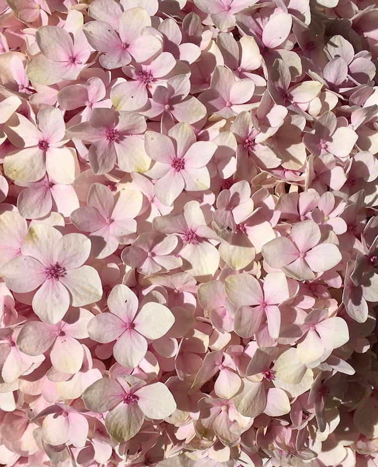
Instead of adding more colours, look into the colour wheel for lighter and deeper versions of your chosen hero colour. This keeps the room simple and sharp, but adds depth in shades of the same colour through layers of throws and upholstery. Lighter and darker/stronger versions of the same colour make for perfect partners and an easy life when matching colours together.
It’s hard to sum up using the colour wheel in one short page like this, but this will hopefully give you a guide and the confidence to start giving it a go yourself. Have fun.
