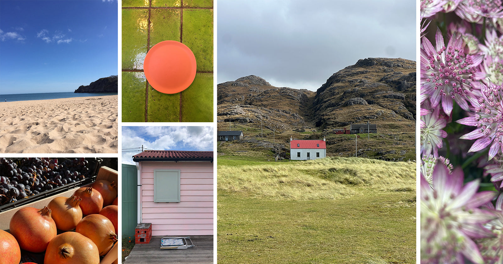

Hello, I’m Molly, and I love colours - all of them - and the endless possibilities. Colour has the ability to shift a mood, soften, or bring a room to life. The trick, though, is knowing where to begin. Creating your own personal room colour palette doesn’t need to feel daunting. In fact, it’s soooo much fun, and it really is easy peasy… and quite often just sitting there in your camera roll.
Begin with a picture you love. Not one you think you should love, or one that feels particularly worthy of a magazine, but something that genuinely draws you in because of its colours. It might be a photograph you’ve taken on holiday, a snapshot of your garden at a certain time of year, or something you’ve found on Pinterest. There’s no right or wrong here. If the colours make you look, that’s enough.
Once you have your picture, take a moment to look at it properly. You’re going to choose one colour from it to act as your hero. This should be one of the easier, more liveable shades. Think soft blues, warm creams, gentle greens or anything that feels calm and natural. These are the colours that sit comfortably on walls, larger pieces of furniture, or your main textiles, so choose something that won’t overwhelm the room.
Now for my little trick, to help your eyes find the best colours. Take a piece of card and cut a small hole into it. It feels a little old school, but it works. Place this over your image and begin to move it slowly across the surface, allowing only small glimpses of colour to appear through the hole. It’s a super simple way to focus your eye. As you move your little window around, you’ll start to notice colours you hadn’t initially paid attention to.
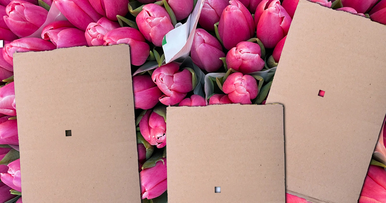
Keep going until you’ve found around five additional colours that sit happily alongside your starting point. Together, these will form your personal colour palette. Because you’ve built it from an image you already love, there should be a natural flow to it. Use the strongest colours as accents.
Once you have your palette, the real fun begins. This is where you start to translate those colours into your room. Your main colour, the easy one you selected at the start, should take the lead. It might appear on your walls, your bed linen, or a sofa. These are the areas that ground the space and make it feel calm and cohesive.
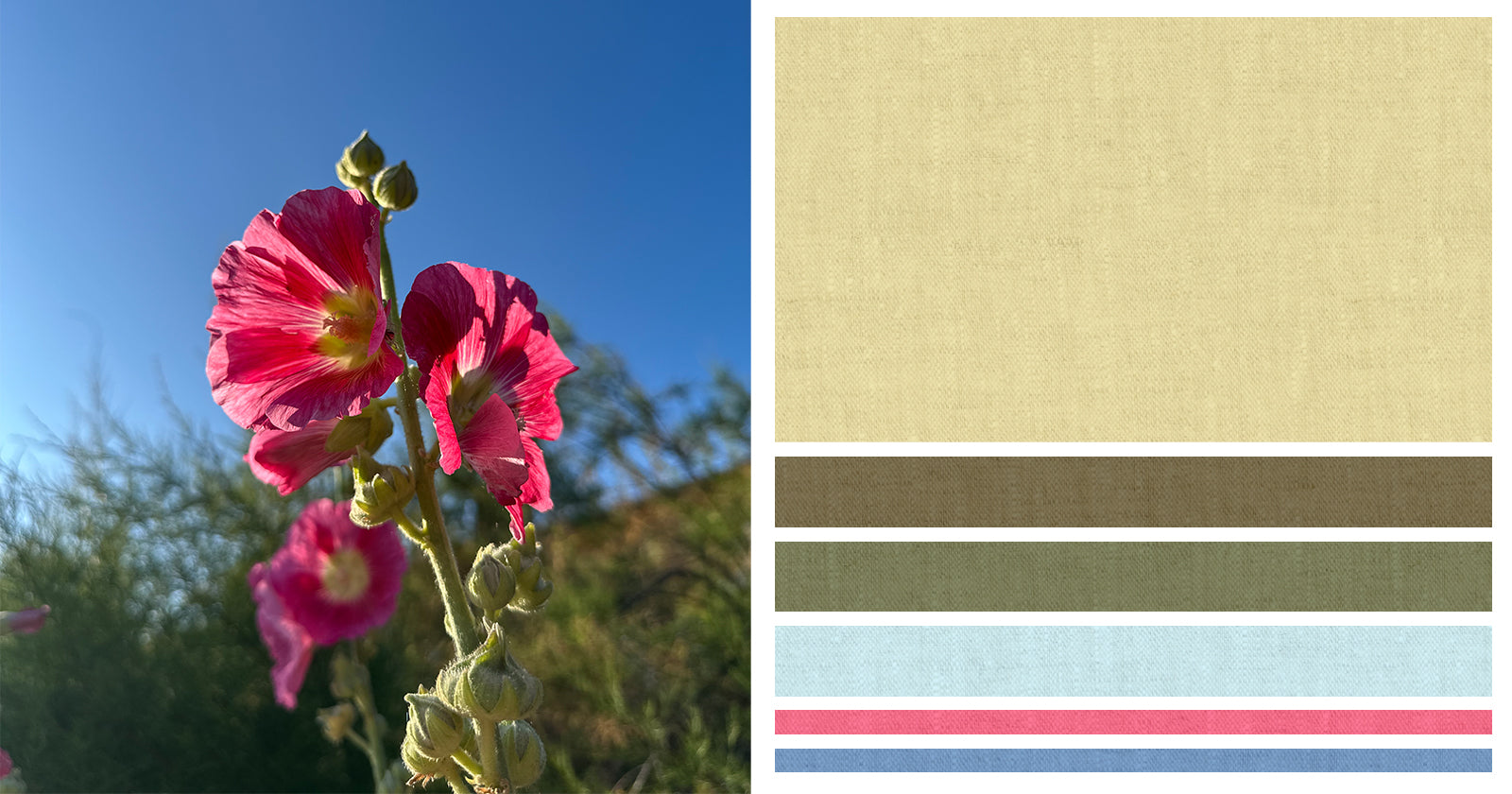
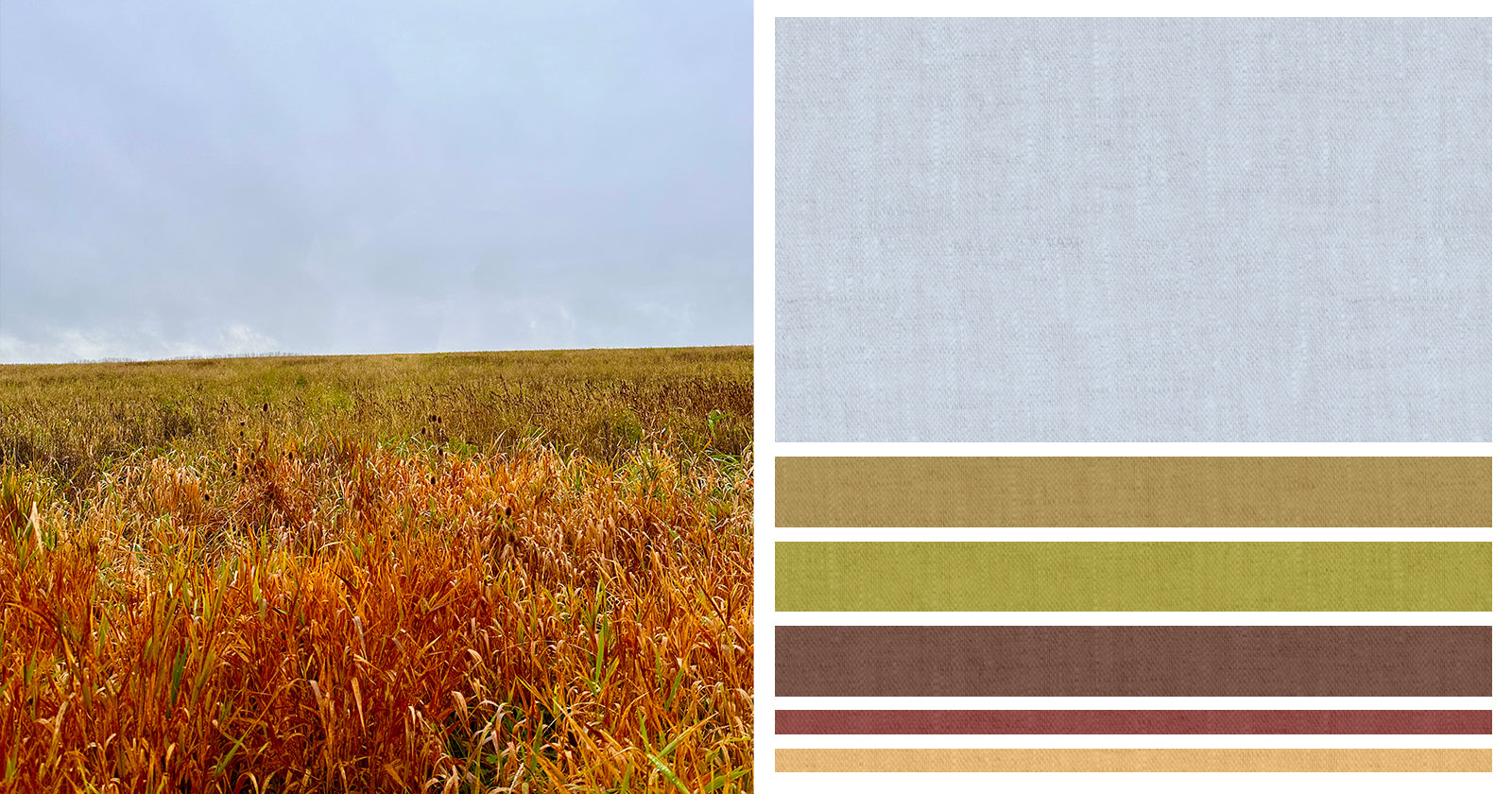
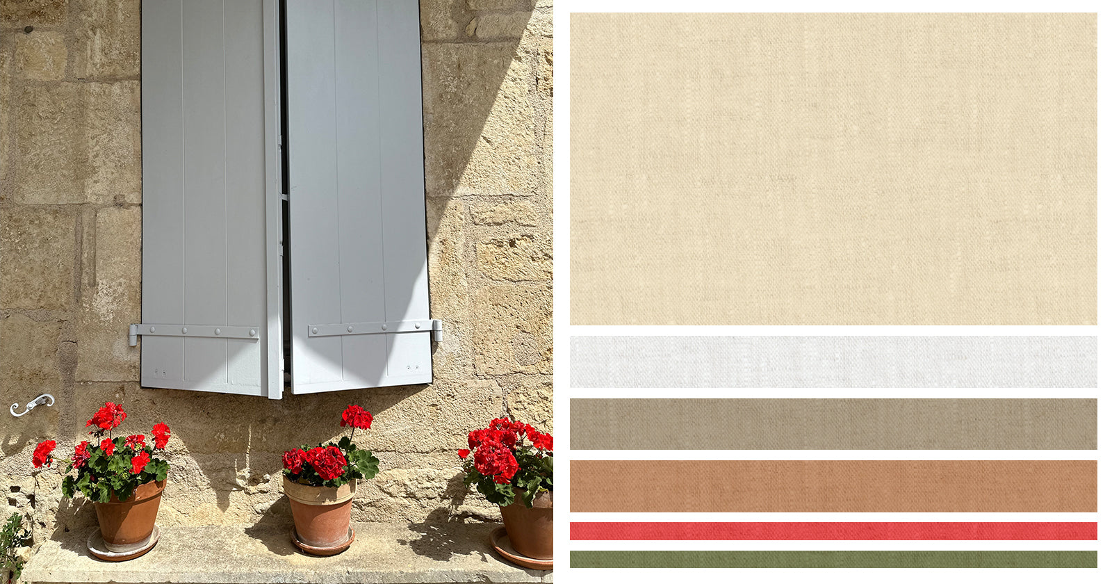
The remaining colours can be layered in more gently. Textiles are a lovely place to start. Cushions, throws, curtains or even a rug can introduce those supporting colours. Accessories come next, perhaps a vase, a lamp base or a piece of artwork. These smaller touches allow you to play a little more, bringing in the brighter or deeper tones from your palette without letting them dominate the room.
Don’t forget that the bolder colours in your palette are at their best when used sparingly. Think of them as highlights or little moments of personality dotted throughout your space. They lift everything else, adding depth and interest, but they don’t need to take centre stage. By keeping your larger areas in more natural tones, the whole room feels balanced and easy to live in.
Creating your own colour palette in this way is a super easy process. No rules, this is about you and what you like. By starting with something you already love and building from there, you take the guesswork out of the equation. What you’re left with is a room that feels considered, personal and yours, which, in my view, is exactly how a home should feel.